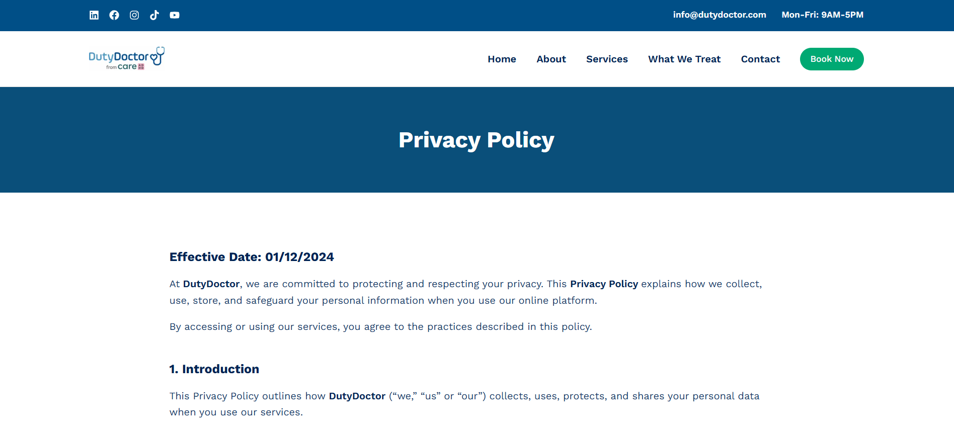
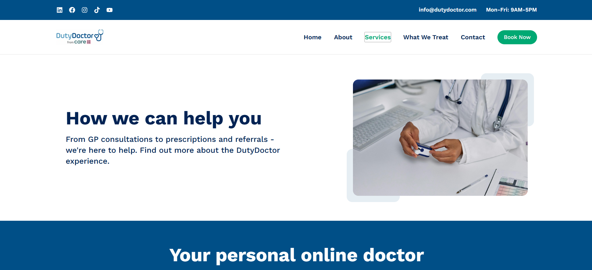
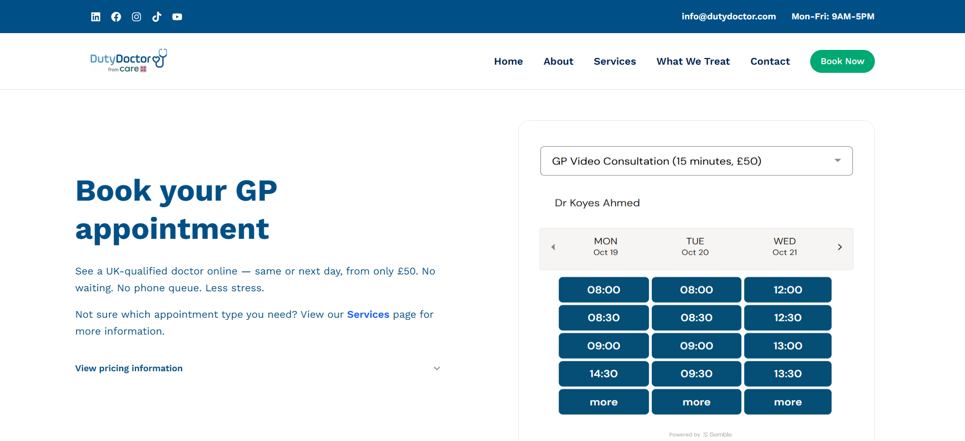
DutyDoctor is a healthcare scheduling and shift management platform designed to streamline physician scheduling, duty allocation, and hospital operations.
The main idea: "Simplify hospital scheduling and empower healthcare teams to manage shifts efficiently and fairly."
My Contribution: I supported the design team by creating responsive UI designs for the web platform, focusing on usability, clarity, and team collaboration workflows.
User-Centered Design - Focus on healthcare administrators and physicians with intuitive interfaces for fast decision-making.
Information Hierarchy - Clear visual hierarchy to prioritize critical scheduling information and actions.
Responsive Layout - Flexible grid system and adaptive components for all screen sizes.
Accessibility First - Color contrast, readable typography, and clear navigation for all users.
Team Collaboration - Visual feedback, notifications, and shared views to support coordinated workflows across the hospital.
Hospital and healthcare organizations struggle with efficient physician scheduling and duty management. Key challenges include:
Design Goal: Create an intuitive, responsive scheduling platform that streamlines physician duty allocation, improves team coordination, and gives administrators clear visibility into hospital staffing.
Key Screens & Components Designed:
Physician Scheduling Dashboard - Main view showing all physicians, shifts, departments, and assignments
Shift Calendar View - Interactive monthly/weekly calendar for viewing and assigning shifts
Duty Roster Cards - Visual representation of each physician's assigned duties, leave, and availability
Staff Directory - Filterable list of physicians with specialization, experience, and availability status
Leave Request Modal - Interface for submitting and managing leave requests
Shift Assignment Panel - Drag-and-drop interface for assigning shifts to physicians
Notifications & Alerts - Visual feedback for schedule changes and important updates
Responsive Layouts - Designs that adapt seamlessly from desktop to mobile devices
Component Library - Reusable buttons, cards, tables, modals, and navigation patterns
Challenge 1: Displaying Complex Data - Presenting multiple scheduling variables (physicians, departments, shifts, availability, leave) without overwhelming the user. Solution: Hierarchical layout with tabs, filters, and color-coding for quick visual scanning.
Challenge 2: Mobile Responsiveness - Ensuring the scheduling interface works on smaller screens without losing functionality. Solution: Collapsible sections, scrollable tables, and touch-friendly interactive elements.
Challenge 3: Visual Hierarchy - Guiding users to critical actions (assign shifts, view coverage gaps) while keeping supporting information accessible. Solution: Large primary buttons, prominent alerts, and contextual menus.
Challenge 4: Team Collaboration - Supporting multiple stakeholders (admins, supervisors, physicians) with different needs. Solution: Role-based views and varying levels of detail for different user types.
Visual Direction - Calm & ADHD-Friendly:
Color Palette (Restrained):
Typography & Spacing:
Interaction Principles:
Overall Tone: Calm, friendly, respectful. Visual design reinforces that ADHD is a normal variation, not a defect. The interface should feel like a supportive companion, not a clinical tool.
Decision 1: Screening as Tool, Not Diagnosis
Challenge: Adults often self-diagnose via screening tools online, then feel validated or devastated without professional assessment. How do we use screening to educate without over-claiming?
Alternatives Explored: (1) Present screening results with percentile interpretation ("You score higher than 80% of users"), (2) Show results as "symptom intensity" without diagnostic language, (3) Results lead directly to professional assessment recommendation.
Decision Made: Screening results explain what symptoms suggest, but explicitly state "This is NOT a diagnosis. A qualified clinician must assess you." Position the screening as the beginning of the journey, not the destination.
Trade-off: Users may want definitive answers from the app. Gains: Prevents misdiagnosis, builds trust by being honest about limitations, sets healthy expectations for professional assessment.
Remaining Validation Needed: Clinical review by qualified Indian mental-health professionals. User testing to confirm messaging reduces self-diagnosis pressure.
Decision 2: Caregiver Involvement is Optional & Consent-Based
Challenge: In India, family dynamics around mental health are complex. Some users want family involvement; others need autonomy from family. How do we support both without judgment?
Alternatives Explored: (1) Family involvement mandatory, (2) Family involvement optional but default-recommended, (3) Users choose at each stage whether to involve caregivers.
Decision Made: Caregiver involvement is always optional. Users can proceed alone and add caregivers later if they choose. When adding caregivers, app makes clear what data each person sees.
Trade-off: Some users may miss supportive care opportunity. Gains: Respects autonomy, works for users with unsupportive families, makes app accessible to all users regardless of family context.
Remaining Validation Needed: Interviews with Indian adults about family dynamics and care preferences. Assessment of whether optional caregiver involvement affects treatment outcomes.
Decision 3: Immediate Safety vs. ADHD Severity
Challenge: Safety screening questionnaires often conflate "suicidal ideation" with "ADHD symptom severity." A person with severe ADHD may score "high risk" simply because inattention is severe. How do we separate these?
Alternatives Explored: (1) Combined safety & ADHD screening in one flow, (2) Separate screening but identical language (confusing), (3) Distinct screening phases with clear labels and different next-step pathways.
Decision Made: Safety screening is distinct and separate. Safety questions ask about immediate danger, self-harm, or crisis. ADHD screening focuses on attention, organization, and impulse control. Results show different pathways: safety concerns → immediate escalation; ADHD symptoms → professional assessment.
Trade-off: Longer onboarding journey. Gains: Prevents false escalation, appropriately triages urgent cases, de-stigmatizes ADHD severity as "not automatically a crisis."
Remaining Validation Needed: Clinical review by Indian mental-health professionals. User testing with ADHD adults to confirm messaging doesn't minimize real safety concerns.
Designed Screens & Flows:
Future Design Phases (Not Yet Completed):
Important Clinical & Legal Notes: This design represents UX and user-journey thinking. Implementation requires:
Language Matters in Mental Health Design: Words like "disorder," "defect," "risk," and "abnormal" carry shame. The same clinical information presented as "variation," "difference," and "trait" feels different to users. ADHD-friendly design is as much about de-stigmatization language as it is about interface simplicity.
Screening is Scary: Users coming to an ADHD app often have deep shame and self-doubt. A screening tool that feels clinical and pathologizing drives them away. Making the questionnaire feel like understanding rather than judgment is critical to completion and trust-building.
Indian Context Changes Everything: Designing for India means understanding: family hierarchy and decision-making patterns, literacy diversity (not all users can read English medical terms), cost sensitivity (pricing must be transparent and reasonable), low-bandwidth realities (can't assume always-on connectivity), and cultural attitudes toward mental health (many users face stigma from family and community).
Separation of Concerns Prevents Misdiagnosis: Early iterations combined ADHD screening and safety screening. Testing revealed this causes confusion: a person with severe ADHD symptoms might score "high risk" on a combined scale, leading to inappropriate crisis escalation. Separating these journeys clarifies clinical pathways.
Transparency Builds Adoption: Users don't trust apps that make clinical claims they don't understand. Being explicit about what the app can and cannot do ("screening is not diagnosis," "pricing includes this," "clinician will also assess you") builds more trust than trying to appear more authoritative.
ADHD-Friendly Design Benefits Everyone: Large touch targets, generous spacing, one action per screen, clear progress—these features benefit not just ADHD users but also elderly users, people with motor disabilities, and anyone using the app while distracted or stressed.
Critical Validations Before Launch:
Phase 2 Design & Development:
Success Metrics to Track:
DutyDoctor is a responsive healthcare scheduling platform that simplifies physician duty allocation and empowers hospital teams to manage shifts efficiently, fairly, and transparently.
This case study showcases UI design work supporting a collaborative team effort to solve critical scheduling challenges in healthcare operations.