
Circle of Care: Family Health Monitoring App
AI-powered health data integration, wearable monitoring, family alerts & emergency detection
Project:
Design Concept & Exploration
Duration:
2 months
Deliverables:
Design Concepts, Journey Maps, Documentation
Tools:
Figma, User Flows, Wireframes
Type:
Concept (Not a Launched Product)
Circle of Care is a family health-monitoring app concept designed to keep loved ones connected and informed about each other's health. The app integrates wearable health data, applies AI-powered analysis to detect significant health events, and enables real-time family alerts and emergency notifications. This case study documents my two-month design exploration, including multiple design iterations, user flows, and feature concepts.
Status: Design concept and exploration. This represents design thinking and ideas—not a functional product or proof of clinical effectiveness.
Key Features & User Needs
Through design exploration, I identified core needs and features Circle of Care would address:
- Wearable Integration: Securely collect health data from wearables (steps, heart rate, blood pressure, activity)
- AI Health Analysis: Detect significant anomalies—when metrics spike suddenly (e.g., blood pressure increase) or fall below normal
- Emergency Detection: Recognize potential accidents (sudden inactivity, device removal) and alert family immediately
- Family Alerts: Real-time notifications to family members with clear context about what's happening
- Family Circle Setup: Invite members, manage access permissions, set privacy boundaries
- Health Dashboards: View each family member's vitals, trends, history, and current status at a glance
- Response Actions: Respond to alerts, request help, acknowledge notifications, escalate if needed
- Monitoring Control: Pause monitoring during driving or charging, manage notification preferences
My Role & Responsibilities
I led the complete design exploration for Circle of Care, taking ownership of:
Note: This was individual design exploration work, not a cross-functional team project.
The Problem
Managing the health of aging parents or vulnerable family members is fragmented and anxious. Family members often lack real-time visibility into health status, leading to:
Design Goal: Create a family-centered app that collects health data from wearables, analyzes it with AI, and instantly alerts family members to significant health events or safety concerns—giving families peace of mind and faster response times.
Research Phase
User Research
Conducted interviews with 10 frequent e-commerce users to understand pain points.
Collected insights from user reviews and feedback on the app store.
Key Findings
Users wanted simplified navigation and better filter options.
Many users found the product pages too information-heavy.
Mobile users preferred quick access to the cart and checkout.
Competitor Analysis
Amazon
StrengthsSeamless product search with smart recommendations.
Detailed product pages with reviews, ratings, and Q&A.
One-click purchase for faster checkout.
Weaknesses
Overwhelming design for new users.
Too many promotions causing distractions.
Strengths
Zara
StrengthsMinimalist, visually appealing design focused on aesthetics.
Strong emphasis on seasonal collections and trends.
One-click purchase for faster checkout.
Weaknesses
Limited filter options, leading to a longer browsing time.
No real-time family communication about health status.
Strengths
Two-Month Design Exploration Process
I spent two months exploring the Circle of Care concept through iterative design cycles. The process involved:
Early Exploration (Weeks 1-2): Understanding the problem space, sketching different family-monitoring scenarios, and defining core user journeys. Explored how family relationships affect information sharing and alert prioritization.
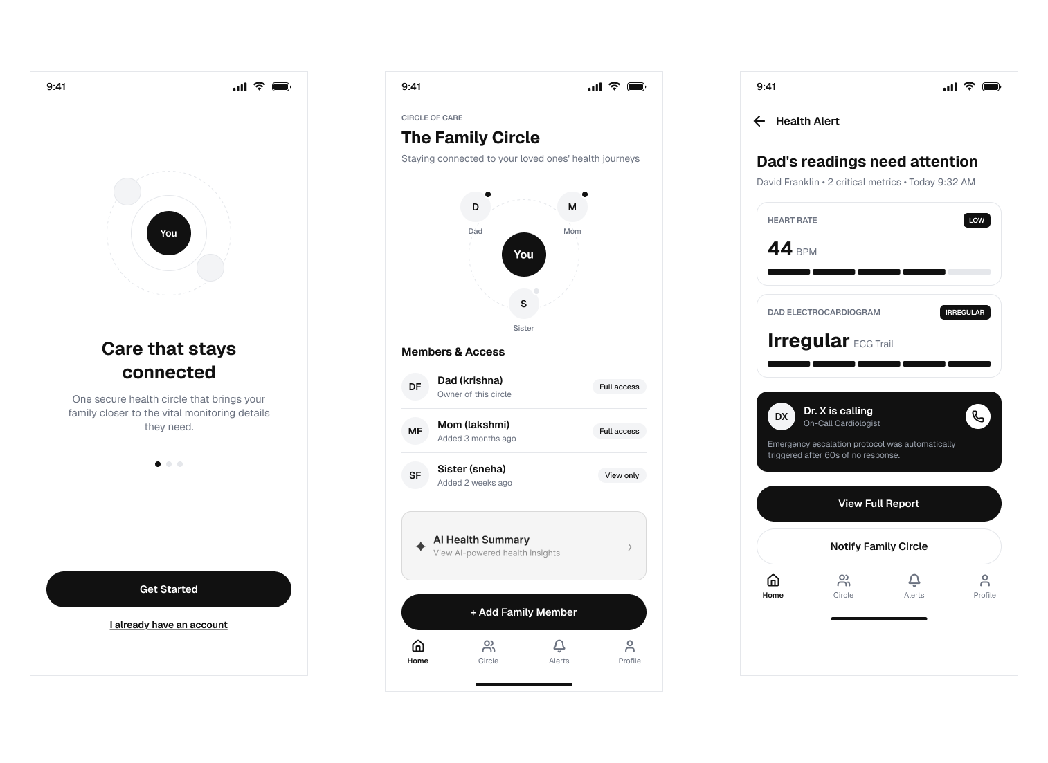
First Iterations (Weeks 3-4): Created wireframes for onboarding, family circle setup, and health dashboards. Tested different approaches to showing health data—some too clinical, some not giving enough context.
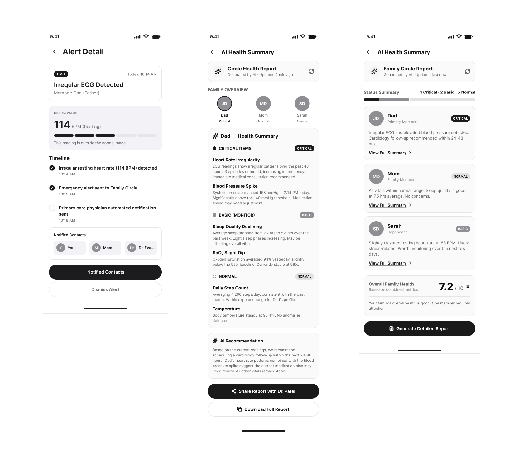
Alert & Response Design (Weeks 5-6): Explored alert designs and response mechanisms. Iterated on how to communicate urgency without causing false alarms. Designed response flows (“I’m Fine,” request help, escalate to emergency).
Safety Feature Exploration (Weeks 7-8): Designed watch-removal detection and accident alerts. Refined permissions and privacy controls. Documented the end-to-end journey with decision points and exceptions. Finalized visual direction.
Current Iteration Count: The current design direction represents multiple iterations. [PLACEHOLDER: Please confirm how many distinct iterations you made across the two months]
Design System & Visual Direction
Color System (Health Context):
Supporting Colors: Neutral grays for secondary information, white for clean backgrounds, light backgrounds to reduce visual strain for elderly users.
Typography: Clear sans-serif typefaces with generous sizing for readability. Emphasis on hierarchy to guide users through health information logically.
Design Principle: Clarity over decoration. All visual elements serve to communicate status, urgency, or action—no ornamental design.
Three Key Design Decisions & Trade-offs
Decision 1: Alert Granularity vs. Alert Fatigue
Challenge: How granular should health alerts be? Too many alerts = ignored. Too few = dangerous.
Alternatives Explored: (1) Alert on every metric outside normal range, (2) Alert only on extreme readings, (3) Configurable thresholds per family member.
Decision Made: Implement configurable thresholds with smart defaults. Different family members (elderly parent with hypertension vs. active adult) have different normal ranges.
Trade-off: More flexibility requires more upfront setup. Family needs to understand what readings matter. Gains: Personalization, reduced false alarms, actionable alerts.
Remaining Validation Needed: Actual usage testing with families to determine if default thresholds are appropriate. Whether configuration is understandable.
Decision 2: Real-time Data vs. Privacy Boundaries
Challenge: Showing real-time health data improves emergency response but threatens privacy. Who should see what?
Alternatives Explored: (1) All family can see all data, (2) Selective sharing per data type (family sees vitals but not detailed history), (3) Elderly person controls what gets shared with whom.
Decision Made: Patient (person being monitored) controls permissions. Can share real-time vitals with spouse, only alerts with adult children, nothing with extended family. Emergencies override privacy.
Trade-off: More permissions to manage initially. Gains: Respects autonomy and dignity. Makes the app trustworthy—elderly are willing to use it if they maintain control.
Remaining Validation Needed: Real family conversations about what data they want to share. Clinical assessment of emergency override appropriateness.
Decision 3: Device Removal Detection Sensitivity
Challenge: Watch removal could mean (a) Genuine emergency/accident, (b) Just charging, (c) Showering, (d) Forgot to put back on.
Alternatives Explored: (1) Alert immediately on removal, (2) Wait 1 hour then alert, (3) Ask user if intentional before alerting family.
Decision Made: Distinguish planned pauses (charging, driving, activity mode) from unexpected removal. Planned pauses are pre-scheduled—no alerts. Unexpected removal = soft alert to the person ("Is everything okay?") after 30 minutes. Only escalate to family after 2 hours with no response.
Trade-off: More complex logic, but reduces false alarms. Gains: Catches real emergencies while respecting normal behavior.
Remaining Validation Needed: How well does device actually detect removal? Real-world testing of alert timing appropriateness.
Final Design Scope
Existing Design Concepts:
Proposed Future Additions (Not Yet Designed):
Important Note on Limitations: These designs represent concepts and UX thinking. They do NOT constitute a functional, tested, clinically-validated system. AI health analysis would require clinical validation. Emergency response features would need legal, healthcare, and emergency-response compliance review.
Lessons Learned
Healthcare Design Complexity: Health-related design touches lives. Every decision (alert timing, permission structure, response mechanisms) has real safety and trust implications. Design thinking must account for worst-case scenarios and human behavior under stress.
Autonomy vs. Protection Tension: Elderly users need monitoring but don't want to feel infantilized or lose agency. The design must enable care while respecting dignity. Family motivation is often care, but the system must prove it respects the monitored person's preferences and control.
Iteration Reveals Hidden Complexity: Early iterations seemed straightforward (collect data, send alert, done). As I iterated, I discovered layers: false alerts destroy trust, privacy violations prevent adoption, device realities (removal, battery life, connectivity) change the design completely.
Visual Clarity is Critical: In health context, ambiguity is dangerous. I learned to eliminate decorative design entirely—every color, every element must communicate status or guide action. A poorly understood interface in a health app could cause missed symptoms or unnecessary panic.
Documentation is Design Too: The journey map, decision rationale, and edge-case documentation became as important as the actual screens. Someone implementing this needs to understand the "why" behind alert logic, permission structures, and exception handling.
Future Improvements & Validation Priorities
Before Any Implementation:
Phase 2 Design Work:
Success Metrics to Establish: